A translator that corrects, fixes and translates messages in greek to any language.
I was given by my client, a mobile programmer, the task to redesign an already existing app with a UI that was way behind current design trends which competitors are adopting. Keeping in mind client's needs, critiques and features to be added to it.
August 2021
Figma
Client and I
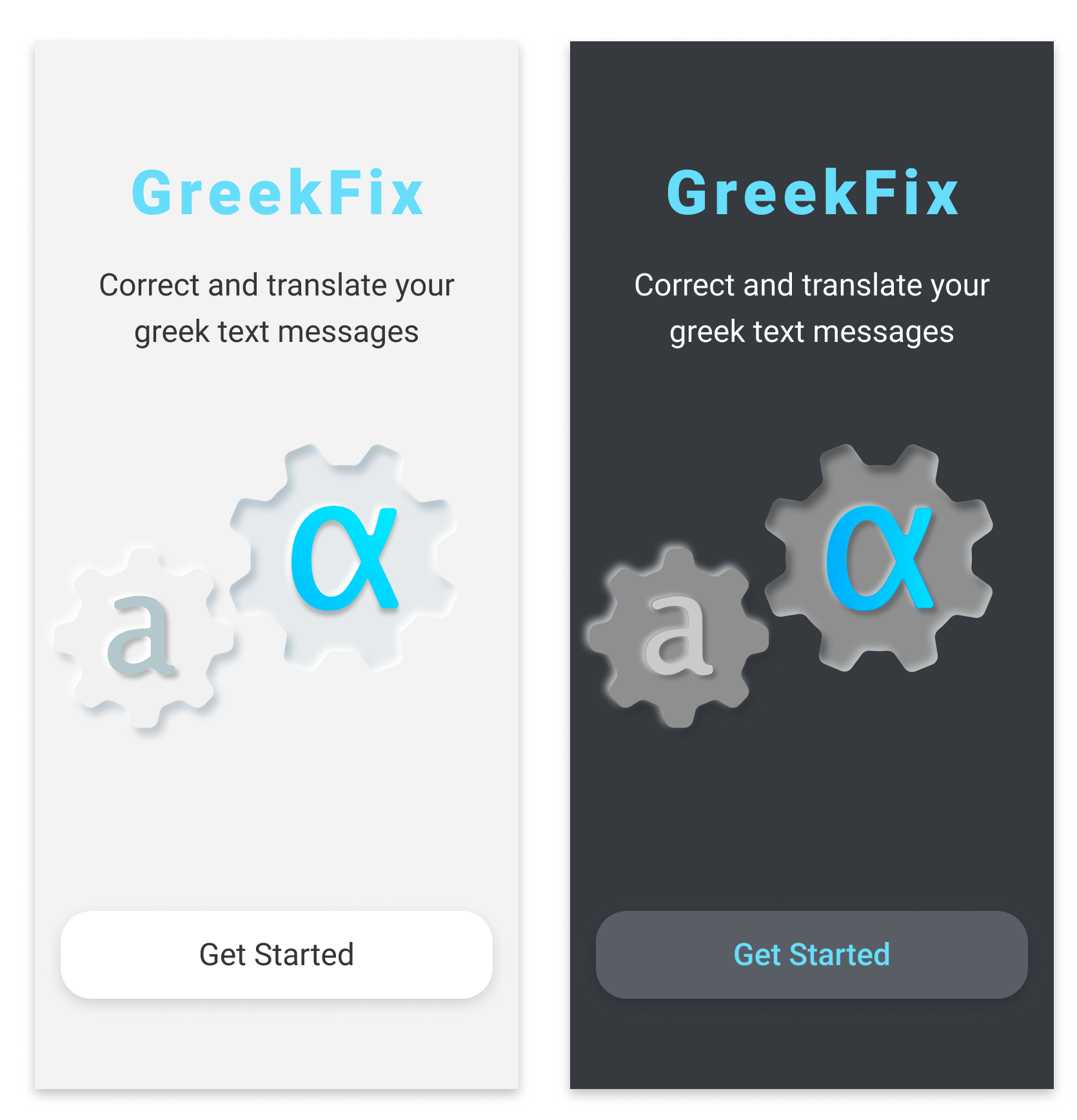
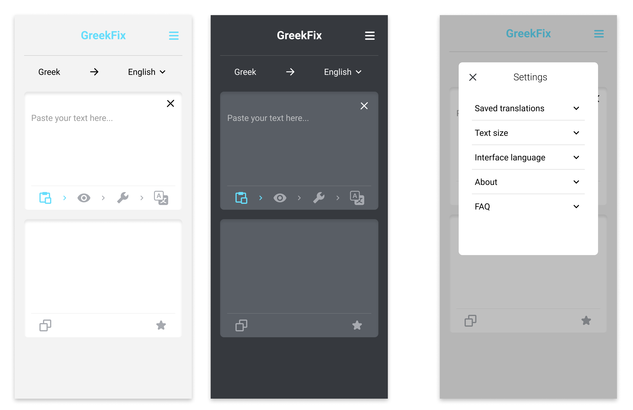
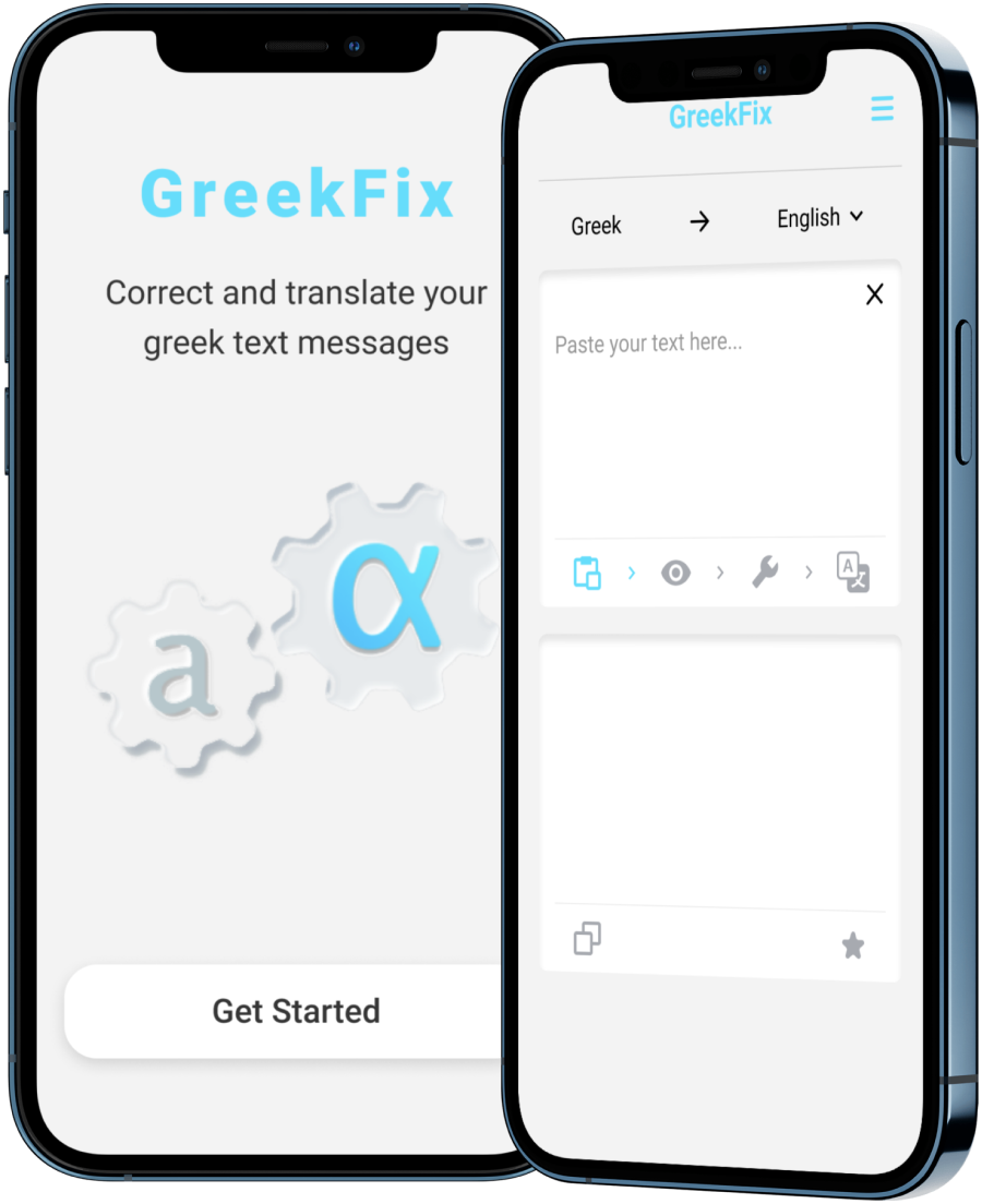
After consultation and critique with the client plus multiple iterations
of designs, we came up with the following new and improved UI with a
modernized and sleek look. Decreasing the excessive amount of input
fields to two and positioning the button icons in the correct order to
be pressed and lightening up in each step to accomplish intuitively the
given task.
Furthermore, all sought-after features were implemented as well.